Make a matrix of plots with a given data set with two different column sets
Usage
ggduo(
  data,
  mapping = NULL,
  columnsX = 1:ncol(data),
  columnsY = 1:ncol(data),
  title = NULL,
  types = list(continuous = "smooth_loess", comboVertical = "box_no_facet",
    comboHorizontal = "facethist", discrete = "count"),
  axisLabels = c("show", "none"),
  columnLabelsX = colnames(data[columnsX]),
  columnLabelsY = colnames(data[columnsY]),
  labeller = "label_value",
  switch = NULL,
  xlab = NULL,
  ylab = NULL,
  showStrips = NULL,
  legend = NULL,
  cardinality_threshold = 15,
  progress = NULL,
  xProportions = NULL,
  yProportions = NULL,
  legends = deprecated()
)
Arguments
- data
data set using. Can have both numerical and categorical data.
- mapping
aesthetic mapping (besides
xandy). Seeaes(). Ifmappingis numeric,columnswill be set to themappingvalue andmappingwill be set toNULL.- columnsX, columnsY
which columns are used to make plots. Defaults to all columns.
- title, xlab, ylab
title, x label, and y label for the graph
- types
see Details
- axisLabels
either "show" to display axisLabels or "none" for no axis labels
- columnLabelsX, columnLabelsY
label names to be displayed. Defaults to names of columns being used.
- labeller
labeller for facets. See
labellers. Common values are"label_value"(default) and"label_parsed".- switch
switch parameter for facet_grid. See
ggplot2::facet_grid. By default, the labels are displayed on the top and right of the plot. If"x", the top labels will be displayed to the bottom. If"y", the right-hand side labels will be displayed to the left. Can also be set to"both"- showStrips
boolean to determine if each plot's strips should be displayed.
NULLwill default to the top and right side plots only.TRUEorFALSEwill turn all strips on or off respectively.- legend
May be the two objects described below or the default
NULLvalue. The legend position can be moved by using ggplot2's theme elementpm + theme(legend.position = "bottom")- a single numeric value
provides the location of a plot according to the display order. Such as
legend = 3in a plot matrix with 2 rows and 5 columns displayed by column will return the plot in positionc(1,2)- a object from
grab_legend() a predetermined plot legend that will be displayed directly
- cardinality_threshold
maximum number of levels allowed in a character / factor column. Set this value to NULL to not check factor columns. Defaults to 15
- progress
NULL(default) for a progress bar in interactive sessions with more than 15 plots,TRUEfor a progress bar,FALSEfor no progress bar, or a function that accepts at least a plot matrix and returns a newprogress::progress_bar. Seeggmatrix_progress.- xProportions, yProportions
Value to change how much area is given for each plot. Either
NULL(default), numeric value matching respective length,grid::unitobject with matching respective length or"auto"for automatic relative proportions based on the number of levels for categorical variables.- legends
![[Deprecated]](figures/lifecycle-deprecated.svg)
Details
types is a list that may contain the variables
'continuous', 'combo', 'discrete', and 'na'. Each element of the list may be a function or a string. If a string is supplied, If a string is supplied, it must be a character string representing the tail end of a ggally_NAME function. The list of current valid ggally_NAME functions is visible in a dedicated vignette.
- continuous
This option is used for continuous X and Y data.
- comboHorizontal
This option is used for either continuous X and categorical Y data or categorical X and continuous Y data.
- comboVertical
This option is used for either continuous X and categorical Y data or categorical X and continuous Y data.
- discrete
This option is used for categorical X and Y data.
- na
This option is used when all X data is
NA, all Y data isNA, or either all X or Y data isNA.
If 'blank' is ever chosen as an option, then ggduo will produce an empty plot.
If a function is supplied as an option, it should implement the function api of function(data, mapping, ...){#make ggplot2 plot}. If a specific function needs its parameters set, wrap(fn, param1 = val1, param2 = val2) the function with its parameters.
Examples
# small function to display plots only if it's interactive
p_ <- GGally::print_if_interactive
data(baseball)
# Keep players from 1990-1995 with at least one at bat
# Add how many singles a player hit
# (must do in two steps as X1b is used in calculations)
dt <- transform(
subset(baseball, year >= 1990 & year <= 1995 & ab > 0),
X1b = h - X2b - X3b - hr
)
# Add
# the player's batting average,
# the player's slugging percentage,
# and the player's on base percentage
# Make factor a year, as each season is discrete
dt <- transform(
dt,
batting_avg = h / ab,
slug = (X1b + 2 * X2b + 3 * X3b + 4 * hr) / ab,
on_base = (h + bb + hbp) / (ab + bb + hbp),
year = as.factor(year)
)
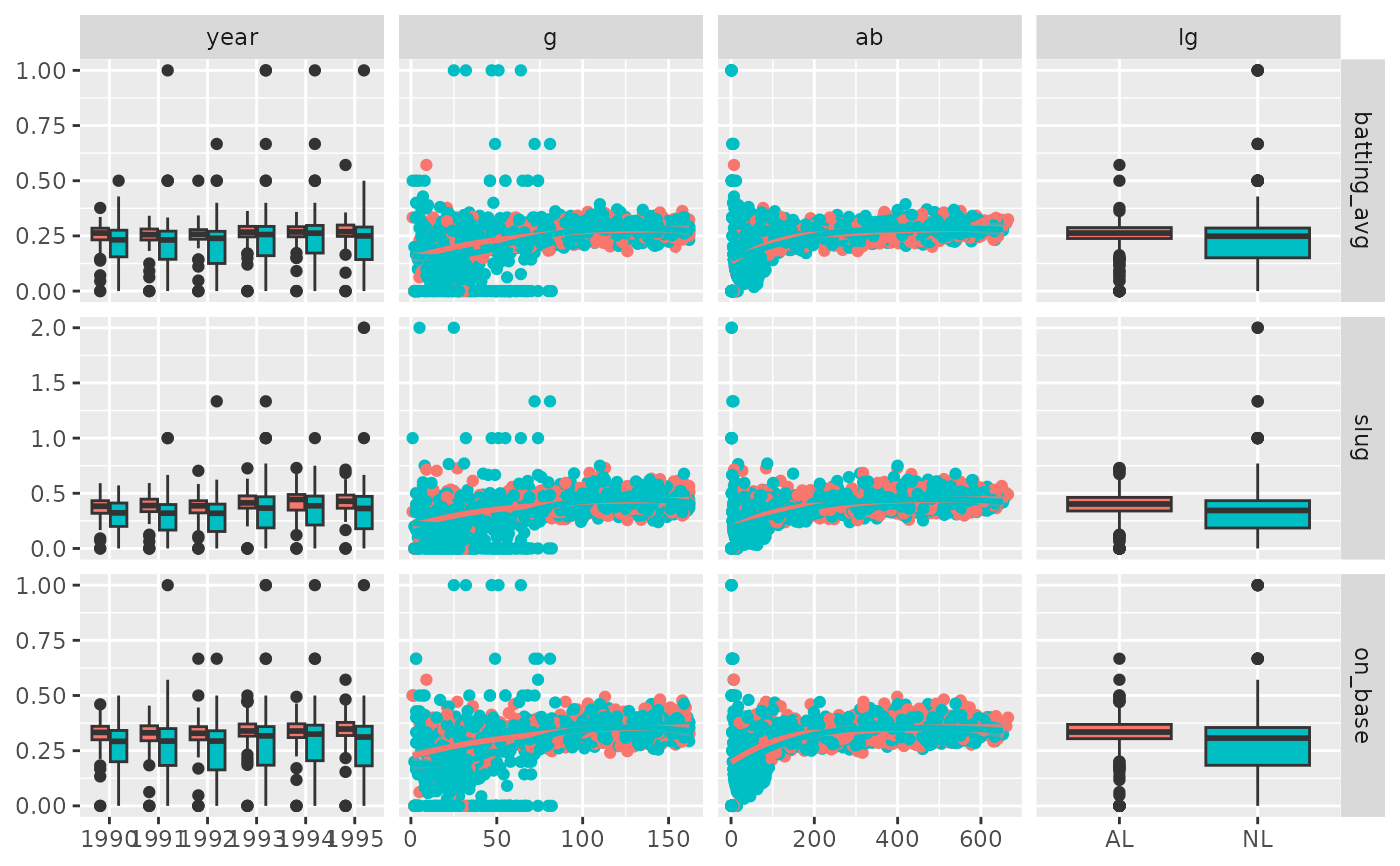
pm <- ggduo(
dt,
c("year", "g", "ab", "lg"),
c("batting_avg", "slug", "on_base"),
mapping = ggplot2::aes(color = lg)
)
# Prints, but
# there is severe over plotting in the continuous plots
# the labels could be better
# want to add more hitting information
p_(pm)
 # address overplotting issues and add a title
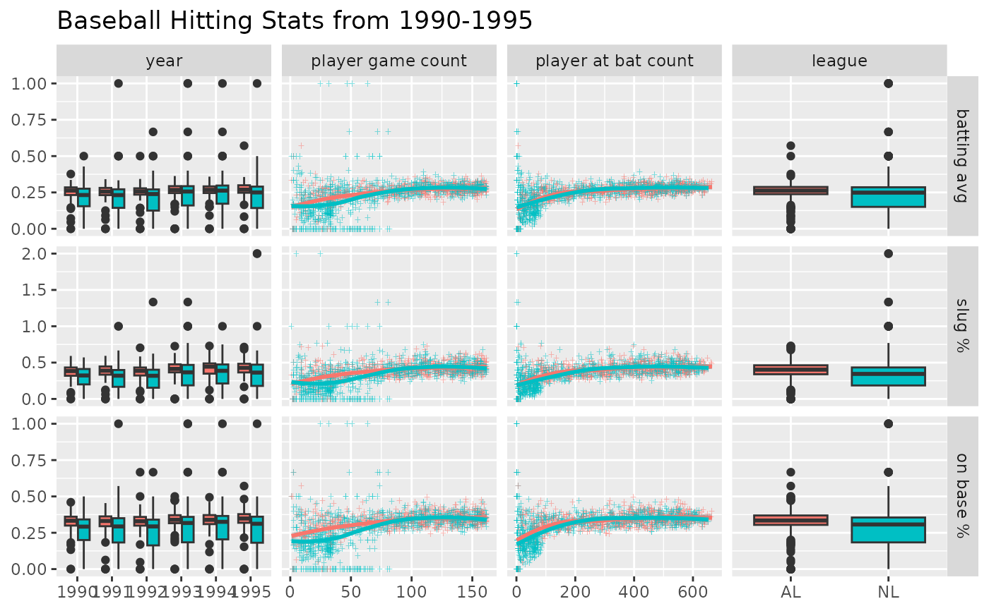
pm <- ggduo(
dt,
c("year", "g", "ab", "lg"),
c("batting_avg", "slug", "on_base"),
columnLabelsX = c("year", "player game count", "player at bat count", "league"),
columnLabelsY = c("batting avg", "slug %", "on base %"),
title = "Baseball Hitting Stats from 1990-1995",
mapping = ggplot2::aes(color = lg),
types = list(
# change the shape and add some transparency to the points
continuous = wrap("smooth_loess", alpha = 0.50, shape = "+")
),
showStrips = FALSE
)
p_(pm)
# address overplotting issues and add a title
pm <- ggduo(
dt,
c("year", "g", "ab", "lg"),
c("batting_avg", "slug", "on_base"),
columnLabelsX = c("year", "player game count", "player at bat count", "league"),
columnLabelsY = c("batting avg", "slug %", "on base %"),
title = "Baseball Hitting Stats from 1990-1995",
mapping = ggplot2::aes(color = lg),
types = list(
# change the shape and add some transparency to the points
continuous = wrap("smooth_loess", alpha = 0.50, shape = "+")
),
showStrips = FALSE
)
p_(pm)
 # Use "auto" to adapt width of the sub-plots
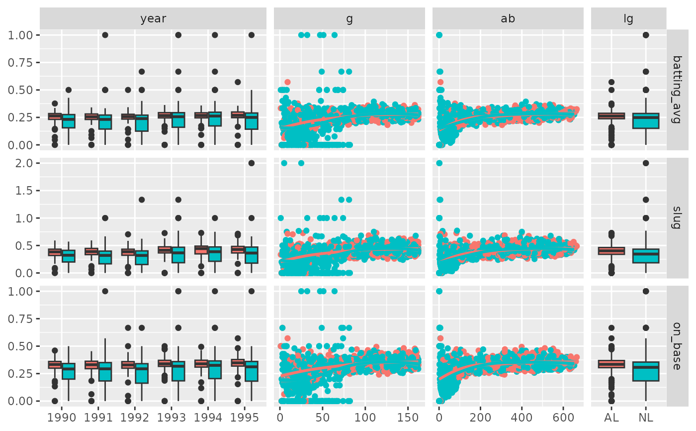
pm <- ggduo(
dt,
c("year", "g", "ab", "lg"),
c("batting_avg", "slug", "on_base"),
mapping = ggplot2::aes(color = lg),
xProportions = "auto"
)
p_(pm)
# Use "auto" to adapt width of the sub-plots
pm <- ggduo(
dt,
c("year", "g", "ab", "lg"),
c("batting_avg", "slug", "on_base"),
mapping = ggplot2::aes(color = lg),
xProportions = "auto"
)
p_(pm)
 # Custom widths & heights of the sub-plots
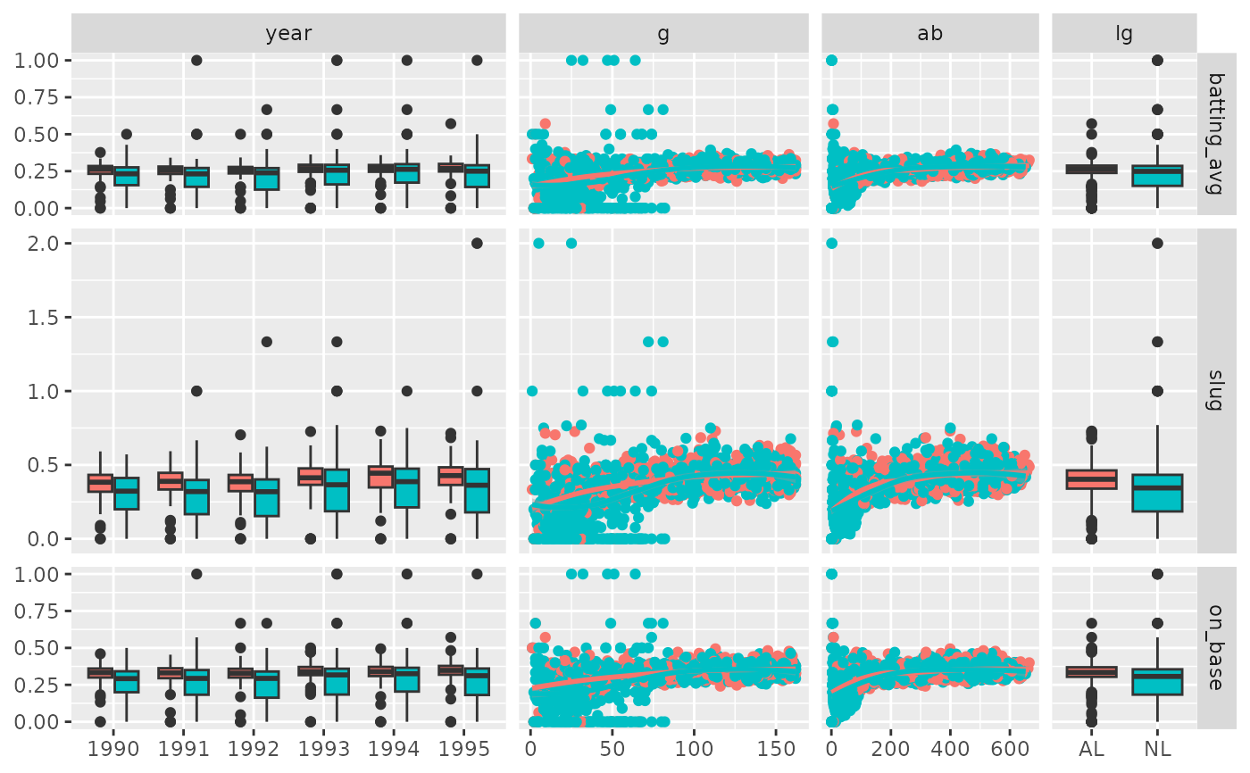
pm <- ggduo(
dt,
c("year", "g", "ab", "lg"),
c("batting_avg", "slug", "on_base"),
mapping = ggplot2::aes(color = lg),
xProportions = c(6, 4, 3, 2),
yProportions = c(1, 2, 1)
)
p_(pm)
# Custom widths & heights of the sub-plots
pm <- ggduo(
dt,
c("year", "g", "ab", "lg"),
c("batting_avg", "slug", "on_base"),
mapping = ggplot2::aes(color = lg),
xProportions = c(6, 4, 3, 2),
yProportions = c(1, 2, 1)
)
p_(pm)
 # Example derived from:
## R Data Analysis Examples | Canonical Correlation Analysis. UCLA: Institute for Digital
## Research and Education.
## from http://www.stats.idre.ucla.edu/r/dae/canonical-correlation-analysis
## (accessed May 22, 2017).
# "Example 1. A researcher has collected data on three psychological variables, four
# academic variables (standardized test scores) and gender for 600 college freshman.
# She is interested in how the set of psychological variables relates to the academic
# variables and gender. In particular, the researcher is interested in how many
# dimensions (canonical variables) are necessary to understand the association between
# the two sets of variables."
data(psychademic)
summary(psychademic)
#> locus_of_control self_concept motivation
#> Min. :-2.23000 Min. :-2.620000 Length:600
#> 1st Qu.:-0.37250 1st Qu.:-0.300000 Class :character
#> Median : 0.21000 Median : 0.030000 Mode :character
#> Mean : 0.09653 Mean : 0.004917
#> 3rd Qu.: 0.51000 3rd Qu.: 0.440000
#> Max. : 1.36000 Max. : 1.190000
#> read write math science
#> Min. :28.3 Min. :25.50 Min. :31.80 Min. :26.00
#> 1st Qu.:44.2 1st Qu.:44.30 1st Qu.:44.50 1st Qu.:44.40
#> Median :52.1 Median :54.10 Median :51.30 Median :52.60
#> Mean :51.9 Mean :52.38 Mean :51.85 Mean :51.76
#> 3rd Qu.:60.1 3rd Qu.:59.90 3rd Qu.:58.38 3rd Qu.:58.65
#> Max. :76.0 Max. :67.10 Max. :75.50 Max. :74.20
#> sex
#> Length:600
#> Class :character
#> Mode :character
#>
#>
#>
(psych_variables <- attr(psychademic, "psychology"))
#> [1] "locus_of_control" "self_concept" "motivation"
(academic_variables <- attr(psychademic, "academic"))
#> [1] "read" "write" "math" "science" "sex"
## Within correlation
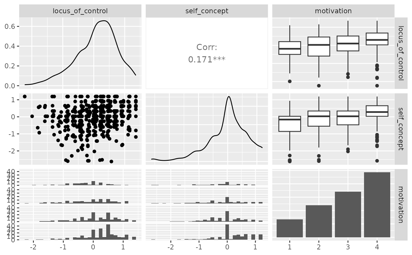
p_(ggpairs(psychademic, columns = psych_variables))
#> `stat_bin()` using `bins = 30`. Pick better value with `binwidth`.
#> `stat_bin()` using `bins = 30`. Pick better value with `binwidth`.
# Example derived from:
## R Data Analysis Examples | Canonical Correlation Analysis. UCLA: Institute for Digital
## Research and Education.
## from http://www.stats.idre.ucla.edu/r/dae/canonical-correlation-analysis
## (accessed May 22, 2017).
# "Example 1. A researcher has collected data on three psychological variables, four
# academic variables (standardized test scores) and gender for 600 college freshman.
# She is interested in how the set of psychological variables relates to the academic
# variables and gender. In particular, the researcher is interested in how many
# dimensions (canonical variables) are necessary to understand the association between
# the two sets of variables."
data(psychademic)
summary(psychademic)
#> locus_of_control self_concept motivation
#> Min. :-2.23000 Min. :-2.620000 Length:600
#> 1st Qu.:-0.37250 1st Qu.:-0.300000 Class :character
#> Median : 0.21000 Median : 0.030000 Mode :character
#> Mean : 0.09653 Mean : 0.004917
#> 3rd Qu.: 0.51000 3rd Qu.: 0.440000
#> Max. : 1.36000 Max. : 1.190000
#> read write math science
#> Min. :28.3 Min. :25.50 Min. :31.80 Min. :26.00
#> 1st Qu.:44.2 1st Qu.:44.30 1st Qu.:44.50 1st Qu.:44.40
#> Median :52.1 Median :54.10 Median :51.30 Median :52.60
#> Mean :51.9 Mean :52.38 Mean :51.85 Mean :51.76
#> 3rd Qu.:60.1 3rd Qu.:59.90 3rd Qu.:58.38 3rd Qu.:58.65
#> Max. :76.0 Max. :67.10 Max. :75.50 Max. :74.20
#> sex
#> Length:600
#> Class :character
#> Mode :character
#>
#>
#>
(psych_variables <- attr(psychademic, "psychology"))
#> [1] "locus_of_control" "self_concept" "motivation"
(academic_variables <- attr(psychademic, "academic"))
#> [1] "read" "write" "math" "science" "sex"
## Within correlation
p_(ggpairs(psychademic, columns = psych_variables))
#> `stat_bin()` using `bins = 30`. Pick better value with `binwidth`.
#> `stat_bin()` using `bins = 30`. Pick better value with `binwidth`.
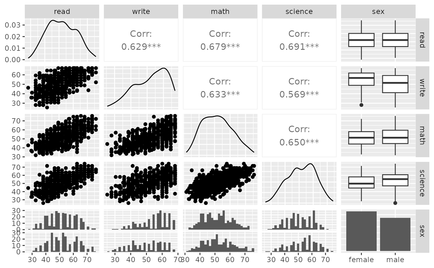
 p_(ggpairs(psychademic, columns = academic_variables))
#> `stat_bin()` using `bins = 30`. Pick better value with `binwidth`.
#> `stat_bin()` using `bins = 30`. Pick better value with `binwidth`.
#> `stat_bin()` using `bins = 30`. Pick better value with `binwidth`.
#> `stat_bin()` using `bins = 30`. Pick better value with `binwidth`.
p_(ggpairs(psychademic, columns = academic_variables))
#> `stat_bin()` using `bins = 30`. Pick better value with `binwidth`.
#> `stat_bin()` using `bins = 30`. Pick better value with `binwidth`.
#> `stat_bin()` using `bins = 30`. Pick better value with `binwidth`.
#> `stat_bin()` using `bins = 30`. Pick better value with `binwidth`.
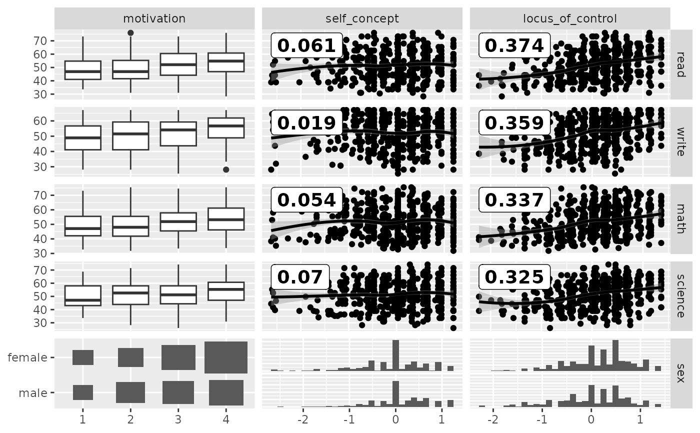
 ## Between correlation
loess_with_cor <- function(data, mapping, ..., method = "pearson") {
x <- eval_data_col(data, mapping$x)
y <- eval_data_col(data, mapping$y)
cor <- cor(x, y, method = method)
ggally_smooth_loess(data, mapping, ...) +
ggplot2::geom_label(
data = data.frame(
x = min(x, na.rm = TRUE),
y = max(y, na.rm = TRUE),
lab = round(cor, digits = 3)
),
mapping = ggplot2::aes(x = x, y = y, label = lab),
hjust = 0, vjust = 1,
size = 5, fontface = "bold",
inherit.aes = FALSE # do not inherit anything from the ...
)
}
pm <- ggduo(
psychademic,
rev(psych_variables), academic_variables,
types = list(continuous = loess_with_cor),
showStrips = FALSE
)
suppressWarnings(p_(pm)) # ignore warnings from loess
#> `stat_bin()` using `bins = 30`. Pick better value with `binwidth`.
#> `stat_bin()` using `bins = 30`. Pick better value with `binwidth`.
## Between correlation
loess_with_cor <- function(data, mapping, ..., method = "pearson") {
x <- eval_data_col(data, mapping$x)
y <- eval_data_col(data, mapping$y)
cor <- cor(x, y, method = method)
ggally_smooth_loess(data, mapping, ...) +
ggplot2::geom_label(
data = data.frame(
x = min(x, na.rm = TRUE),
y = max(y, na.rm = TRUE),
lab = round(cor, digits = 3)
),
mapping = ggplot2::aes(x = x, y = y, label = lab),
hjust = 0, vjust = 1,
size = 5, fontface = "bold",
inherit.aes = FALSE # do not inherit anything from the ...
)
}
pm <- ggduo(
psychademic,
rev(psych_variables), academic_variables,
types = list(continuous = loess_with_cor),
showStrips = FALSE
)
suppressWarnings(p_(pm)) # ignore warnings from loess
#> `stat_bin()` using `bins = 30`. Pick better value with `binwidth`.
#> `stat_bin()` using `bins = 30`. Pick better value with `binwidth`.
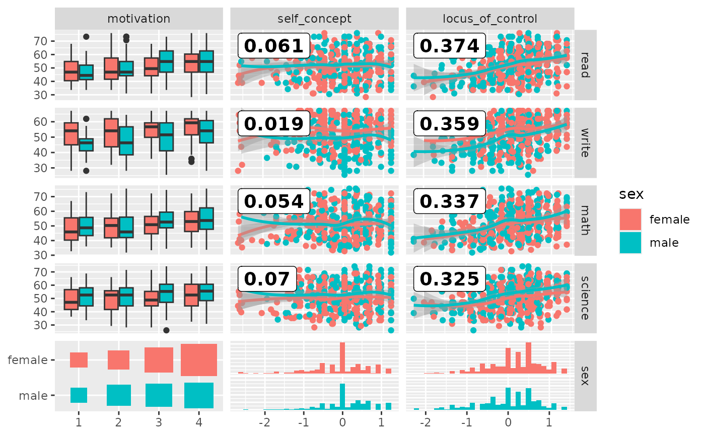
 # add color according to sex
pm <- ggduo(
psychademic,
mapping = ggplot2::aes(color = sex),
rev(psych_variables), academic_variables,
types = list(continuous = loess_with_cor),
showStrips = FALSE,
legend = c(5, 2)
)
suppressWarnings(p_(pm))
#> `stat_bin()` using `bins = 30`. Pick better value with `binwidth`.
#> `stat_bin()` using `bins = 30`. Pick better value with `binwidth`.
#> `stat_bin()` using `bins = 30`. Pick better value with `binwidth`.
# add color according to sex
pm <- ggduo(
psychademic,
mapping = ggplot2::aes(color = sex),
rev(psych_variables), academic_variables,
types = list(continuous = loess_with_cor),
showStrips = FALSE,
legend = c(5, 2)
)
suppressWarnings(p_(pm))
#> `stat_bin()` using `bins = 30`. Pick better value with `binwidth`.
#> `stat_bin()` using `bins = 30`. Pick better value with `binwidth`.
#> `stat_bin()` using `bins = 30`. Pick better value with `binwidth`.
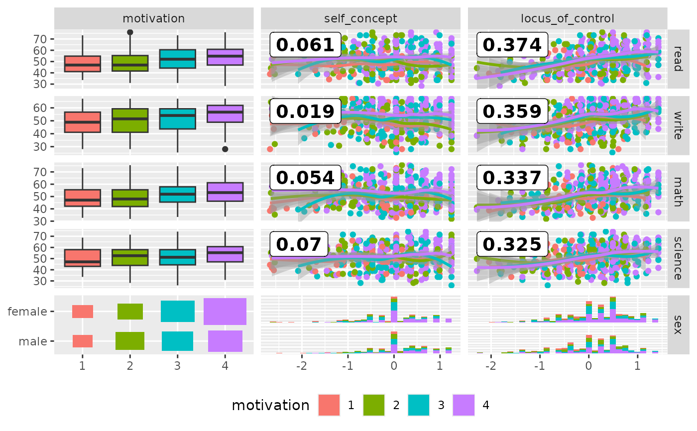
 # add color according to sex
pm <- ggduo(
psychademic,
mapping = ggplot2::aes(color = motivation),
rev(psych_variables), academic_variables,
types = list(continuous = loess_with_cor),
showStrips = FALSE,
legend = c(5, 2)
) +
ggplot2::theme(legend.position = "bottom")
suppressWarnings(p_(pm))
#> `stat_bin()` using `bins = 30`. Pick better value with `binwidth`.
#> `stat_bin()` using `bins = 30`. Pick better value with `binwidth`.
#> `stat_bin()` using `bins = 30`. Pick better value with `binwidth`.
# add color according to sex
pm <- ggduo(
psychademic,
mapping = ggplot2::aes(color = motivation),
rev(psych_variables), academic_variables,
types = list(continuous = loess_with_cor),
showStrips = FALSE,
legend = c(5, 2)
) +
ggplot2::theme(legend.position = "bottom")
suppressWarnings(p_(pm))
#> `stat_bin()` using `bins = 30`. Pick better value with `binwidth`.
#> `stat_bin()` using `bins = 30`. Pick better value with `binwidth`.
#> `stat_bin()` using `bins = 30`. Pick better value with `binwidth`.
 # dt,
# c("year", "g", "ab", "lg", "lg"),
# c("batting_avg", "slug", "on_base", "hit_type"),
# columnLabelsX = c("year", "player game count", "player at bat count", "league", ""),
# columnLabelsY = c("batting avg", "slug %", "on base %", "hit type"),
# title = "Baseball Hitting Stats from 1990-1995 (player strike in 1994)",
# mapping = aes(color = year),
# types = list(
# continuous = wrap("smooth_loess", alpha = 0.50, shape = "+"),
# comboHorizontal = wrap(display_hit_type_combo, binwidth = 15),
# discrete = wrap(display_hit_type_discrete, color = "black", size = 0.15)
# ),
# showStrips = FALSE
## make the 5th column blank, except for the legend
# australia_PISA2012,
# c("gender", "age", "homework", "possessions"),
# c("PV1MATH", "PV2MATH", "PV3MATH", "PV4MATH", "PV5MATH"),
# types = list(
# continuous = "points",
# combo = "box",
# discrete = "ratio"
# )
# australia_PISA2012,
# c("gender", "age", "homework", "possessions"),
# c("PV1MATH", "PV2MATH", "PV3MATH", "PV4MATH", "PV5MATH"),
# mapping = ggplot2::aes(color = gender),
# types = list(
# continuous = wrap("smooth", alpha = 0.25, method = "loess"),
# combo = "box",
# discrete = "ratio"
# )
# dt,
# c("year", "g", "ab", "lg", "lg"),
# c("batting_avg", "slug", "on_base", "hit_type"),
# columnLabelsX = c("year", "player game count", "player at bat count", "league", ""),
# columnLabelsY = c("batting avg", "slug %", "on base %", "hit type"),
# title = "Baseball Hitting Stats from 1990-1995 (player strike in 1994)",
# mapping = aes(color = year),
# types = list(
# continuous = wrap("smooth_loess", alpha = 0.50, shape = "+"),
# comboHorizontal = wrap(display_hit_type_combo, binwidth = 15),
# discrete = wrap(display_hit_type_discrete, color = "black", size = 0.15)
# ),
# showStrips = FALSE
## make the 5th column blank, except for the legend
# australia_PISA2012,
# c("gender", "age", "homework", "possessions"),
# c("PV1MATH", "PV2MATH", "PV3MATH", "PV4MATH", "PV5MATH"),
# types = list(
# continuous = "points",
# combo = "box",
# discrete = "ratio"
# )
# australia_PISA2012,
# c("gender", "age", "homework", "possessions"),
# c("PV1MATH", "PV2MATH", "PV3MATH", "PV4MATH", "PV5MATH"),
# mapping = ggplot2::aes(color = gender),
# types = list(
# continuous = wrap("smooth", alpha = 0.25, method = "loess"),
# combo = "box",
# discrete = "ratio"
# )